Romankiw Brand

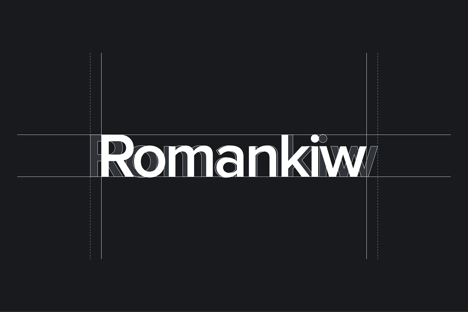
Logo
Optical kerning, refined weight, and defined clearspace, as well as well-delineated placement in relation to other content, all help to make our logo as instantly recognizable as possible at all sizes and in all contexts.
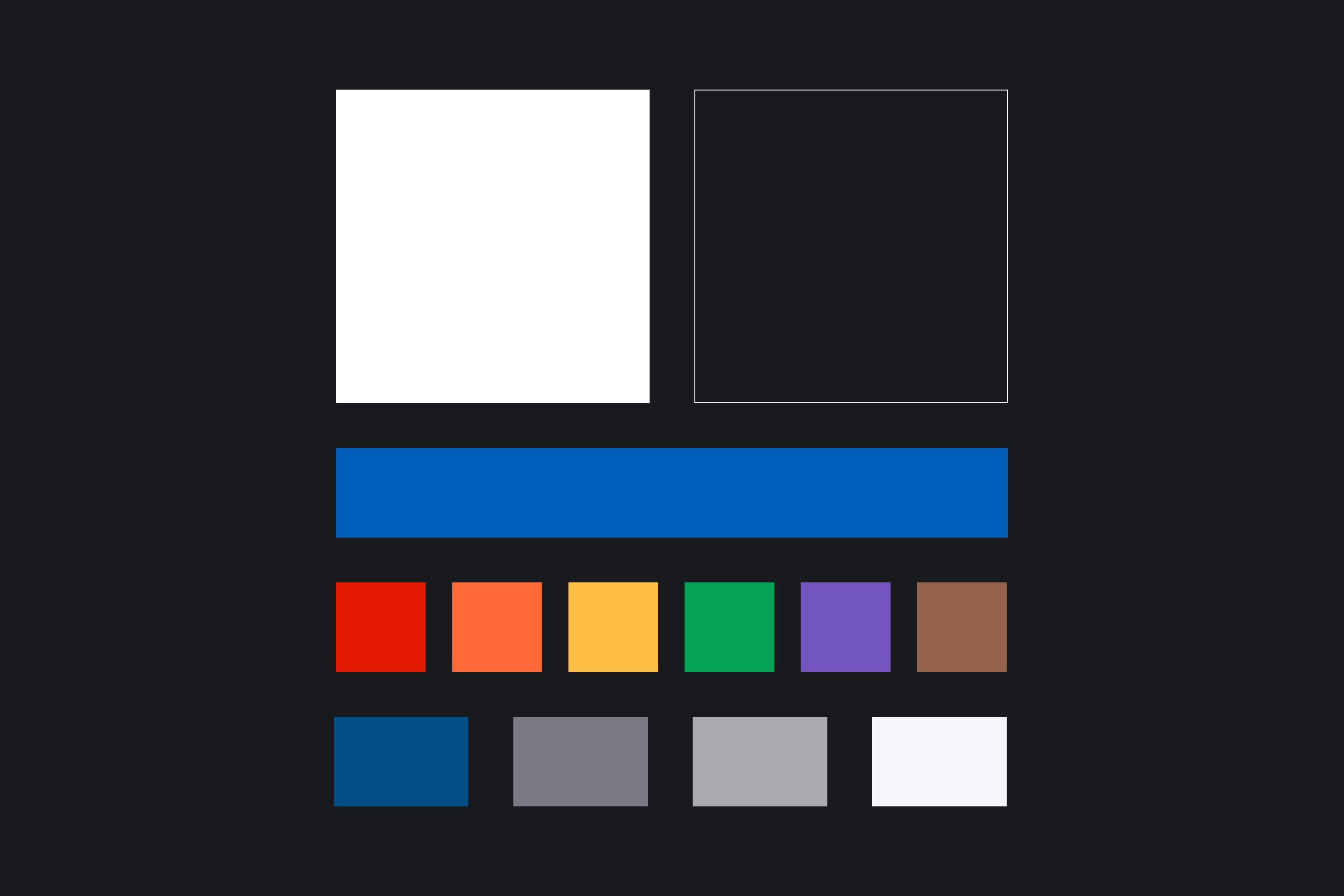
Colors
Our colors position the brand for a simplistic modern aesthetic, with the option for a visually striking graphics. The core of the system is around black and white, two colors that constantly communicate commitment to upholding brand values.
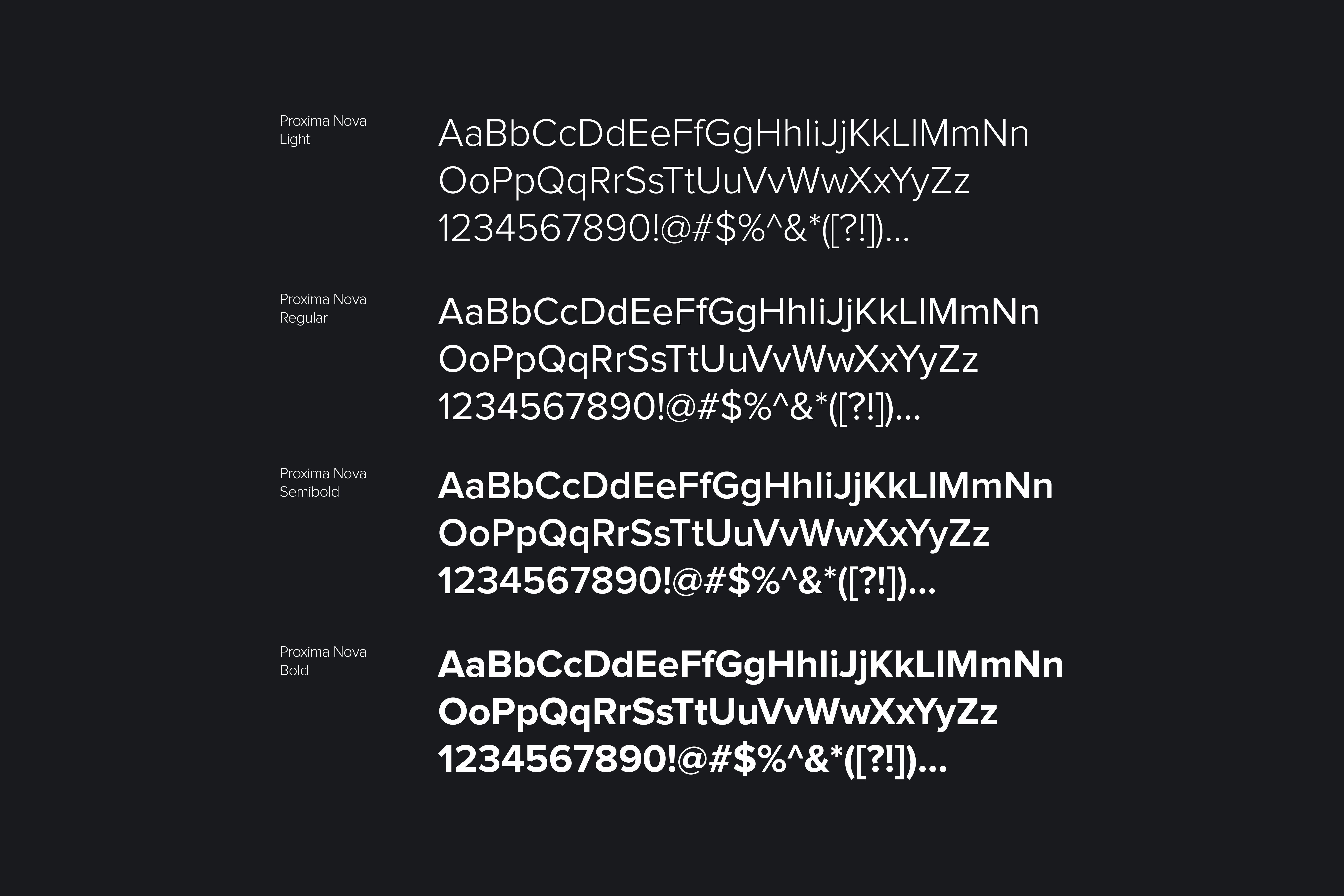
Typography
To ensure a clear message of all brand communications, the Romankiw brand’s typography should be used with as much consistentcy as possible. The brand typeface is Proxima Nova and is to be used across all communication material. It reflects the brand’s modern feel and innovation.To ensure a clear message of all brand communications, the Romankiw brand’s typography should be used with as much consistentcy as possible. The brand typeface is Proxima Nova and is to be used across all communication material. It reflects the brand’s modern feel and innovation.
Iconography
Each icon is based on a 24x24 pixel grid. There is 1px of boarder around all icons. Staying within the foundation shapes ensures that icons appear the best they possibly can, and ensures consistency across the brand. When a stroked icon is used, the width of the stroke should be 1px.

Composition
A grid based system is the core of the composition layout for the Romankiw brand. Breaking compositions into columns helps create consistency across all applications.

How We Speak
Optical kerning, refined weight, and defined clearspace, as well as well-delineated placement in relation to other content, all help to make our logo as instantly recognizable as possible at all sizes and in all contexts.

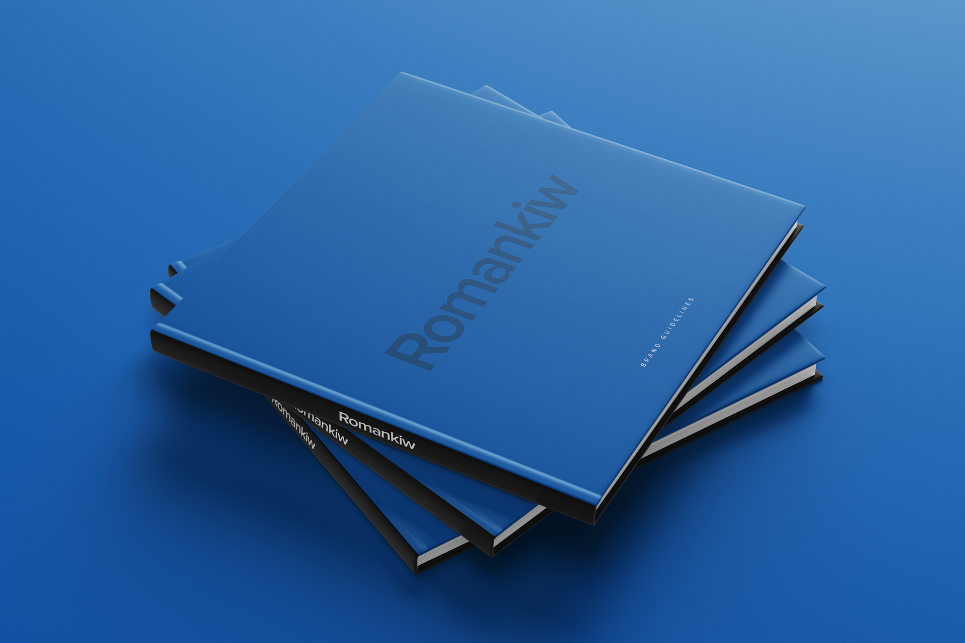
Logo Downloads
Optical kerning, refined weight, and defined clearspace, as well as well-delineated placement in relation to other content, all help to make our logo as instantly recognizable as possible at all sizes and in all contexts.

Romankiw Cinema
Optical kerning, refined weight, and defined clearspace, as well as well-delineated placement in relation to other content, all help to make our logo as instantly recognizable as possible at all sizes and in all contexts.
test
The Romankiw Story
Romankiw Brand Guidelines
Romankiw's brand was born with a centralized mission in mind - to make a home feel more like an experience. I conceptualized this project in 2020, with the idea to make a professional brand out around my last name, Romankiw.
Media Press Kit

Romankiw-Brand-Template
Optical kerning, refined weight, and defined clearspace, as well as well-delineated placement in relation to other content, all help to make our logo as instantly recognizable as possible at all sizes and in all contexts.