Construction
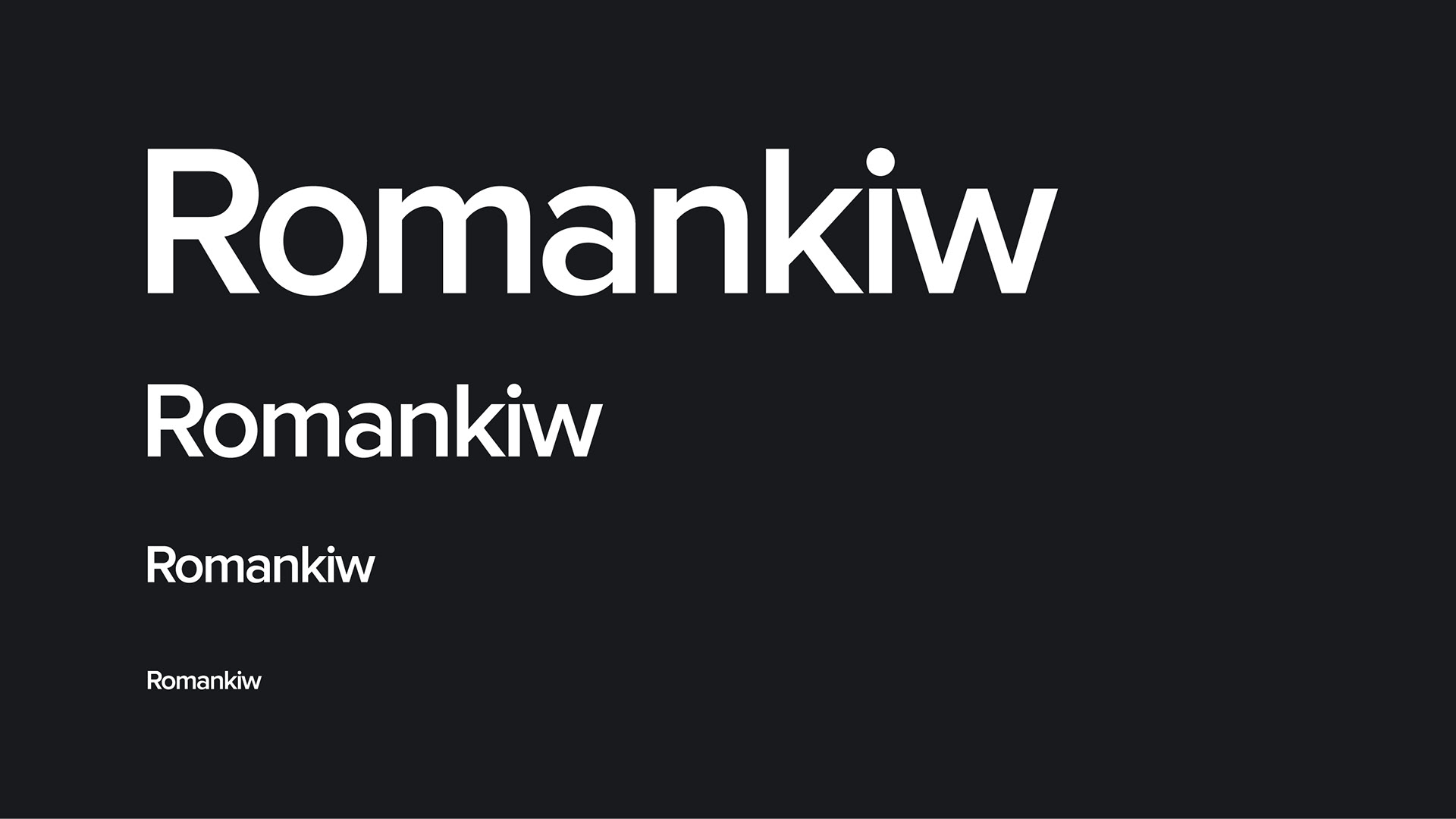
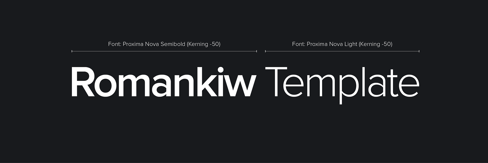
The Romankiw logo was designed by Jarod Romankiw in 2021. The main logo uses the Proxima Nova Semibold typeface. The text is has a kerning of -50 applied in order to densify the space between the letters and give a more modern appeal. The idea of the logo is to provide a timeless centerpiece to the brand, yet also provide an opportunity for further expansion.
Logo
Proxima Nova Semibold
Kerning: -50
Color: White or Black
Clearspace
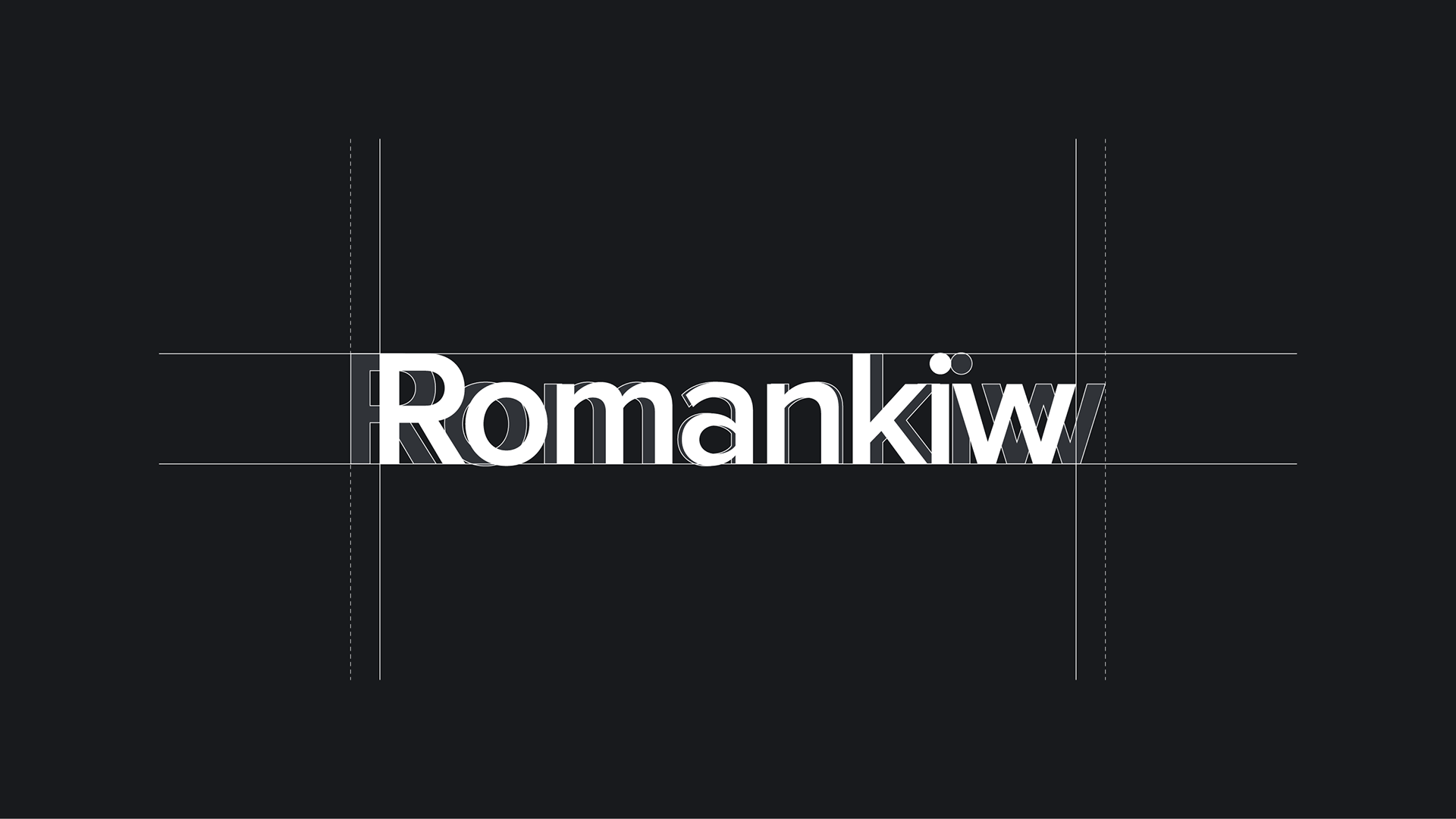
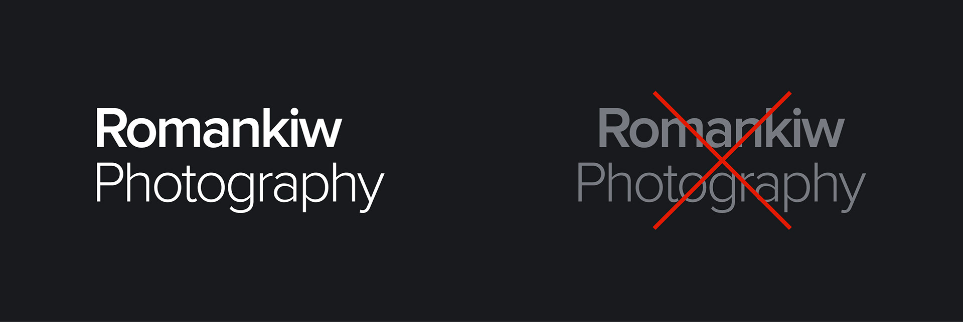
Clear space around the logo creates a buffer from other graphics, images, text, and boarders to reduce the impact on visibility and contrast of the logo. The logo's impact is dependent on it being able to boldly stand out when applied to different scenarios. The amount of clear space around the logo should be equal to or greater than the height of the 'R'.
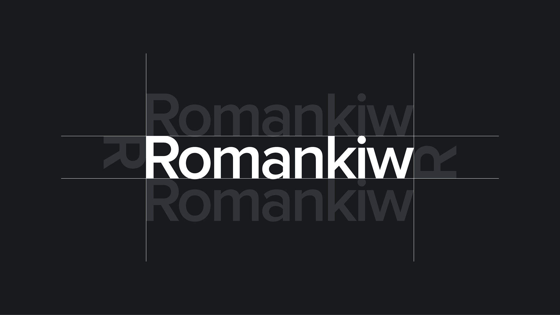
Clear space exceptions
There are cases where the logo can break the clear space rule, but it should be used in a limited fashion to ensure consistent image of the brand.
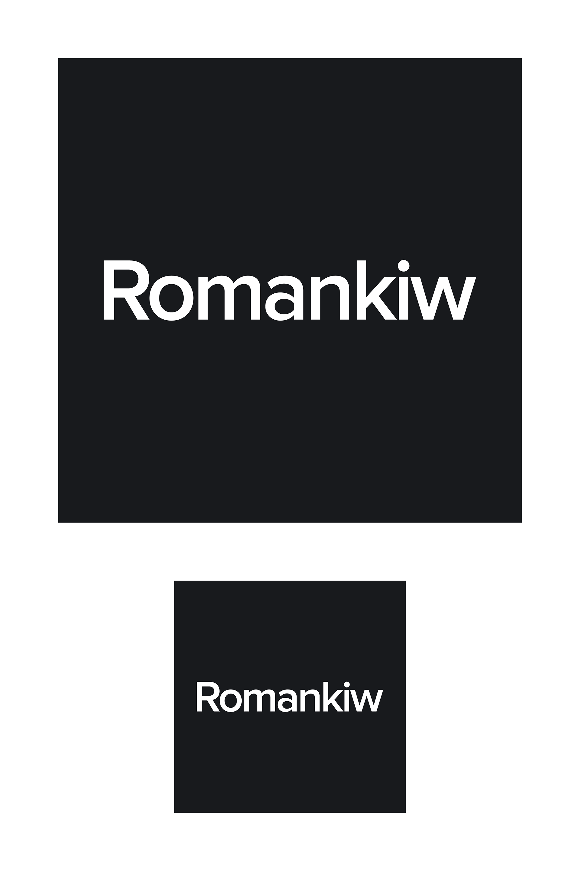
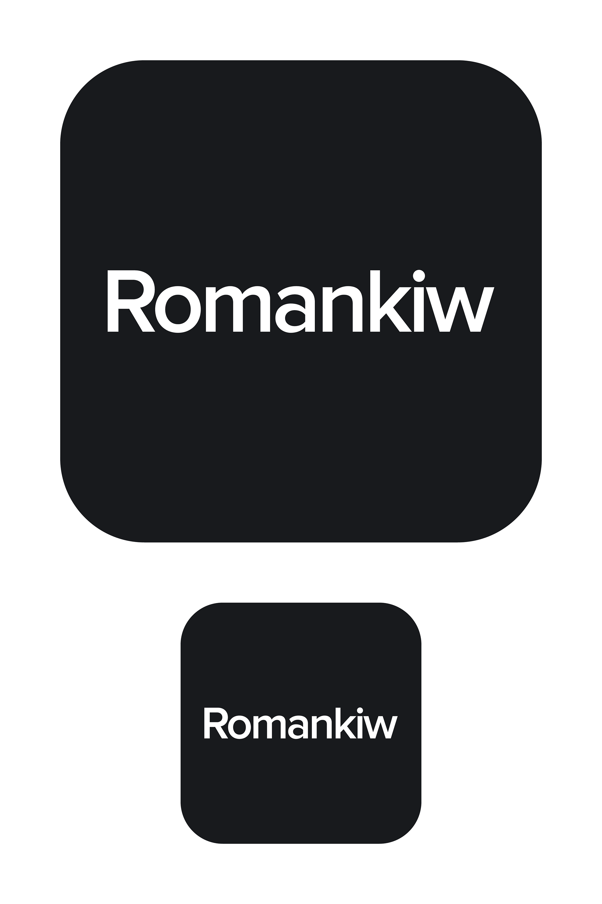
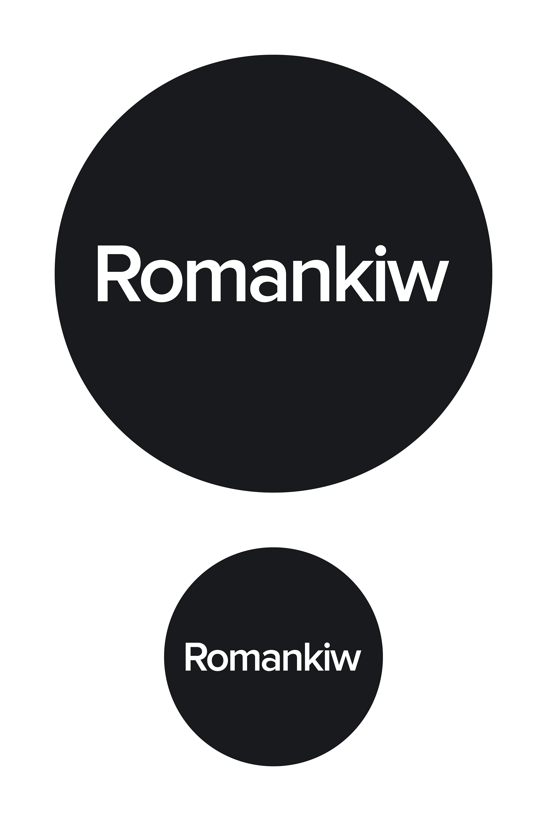
App icons
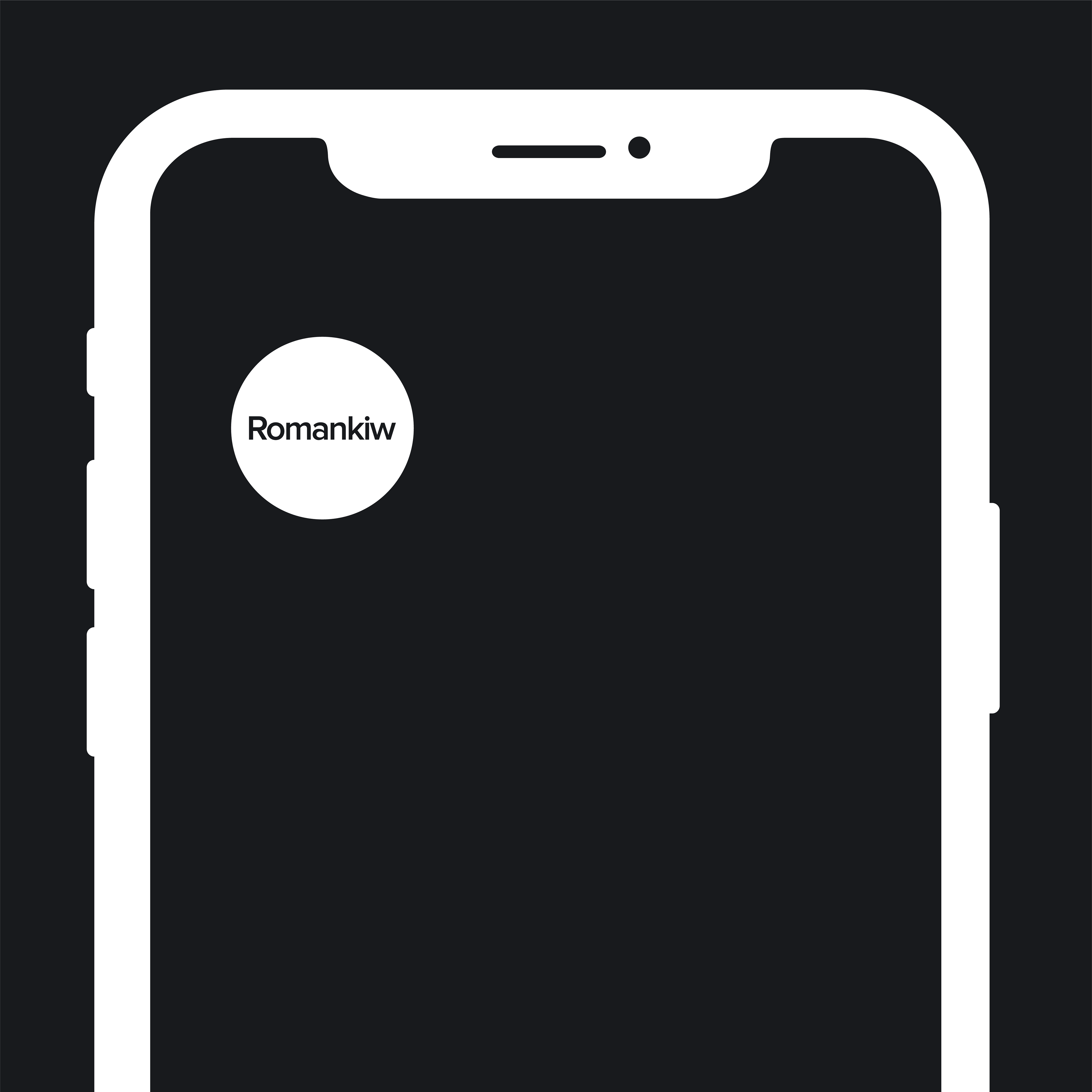
Social icons
Color
Use the correct color logo on high contrast backgrounds to ensure the logo is visible and legible. White on dark backgrounds, and black on light backgrounds is acceptable.
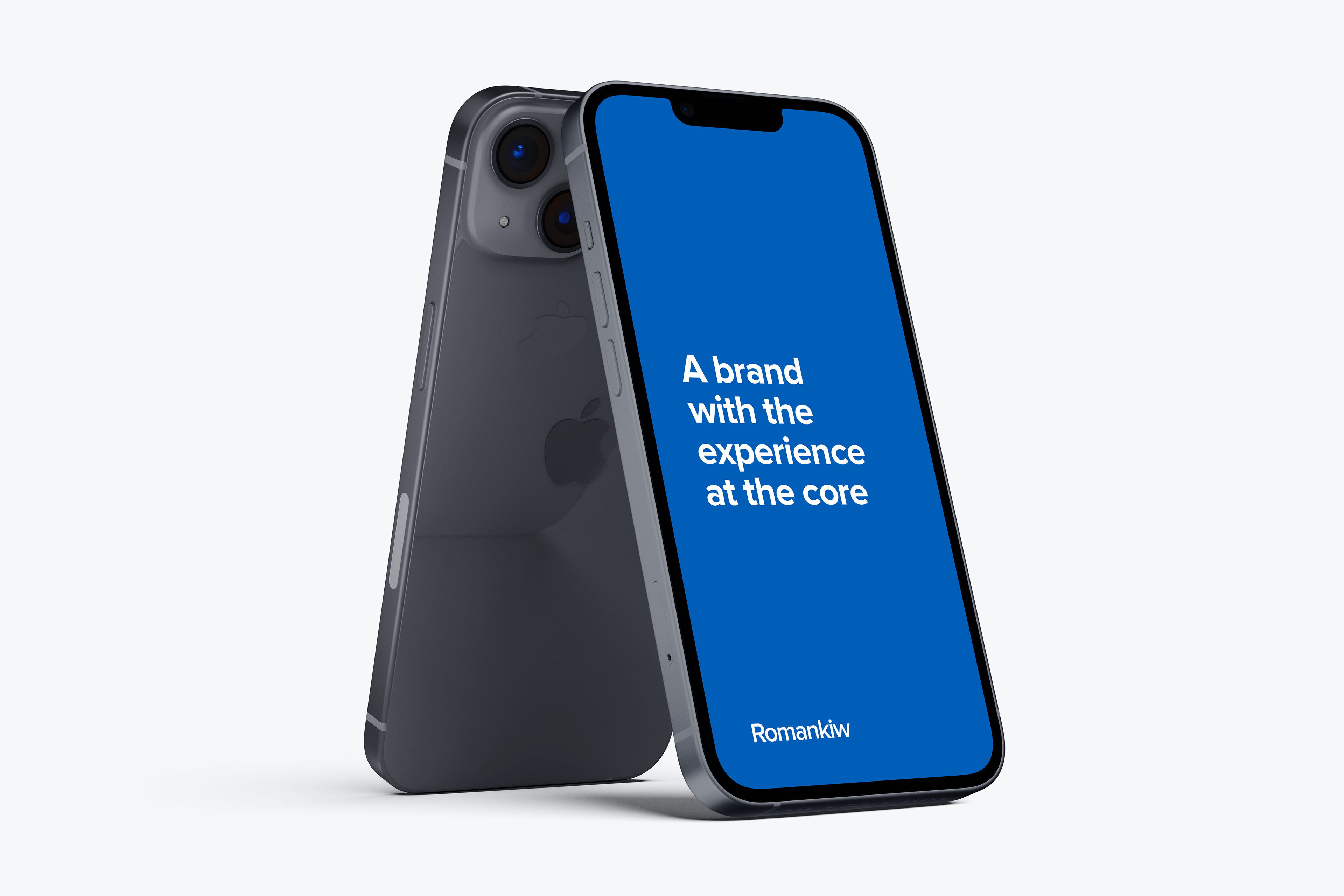
Scale
Our logo is designed to scale to small sizes on print and screen, and should never be so small that the logo can't be read.
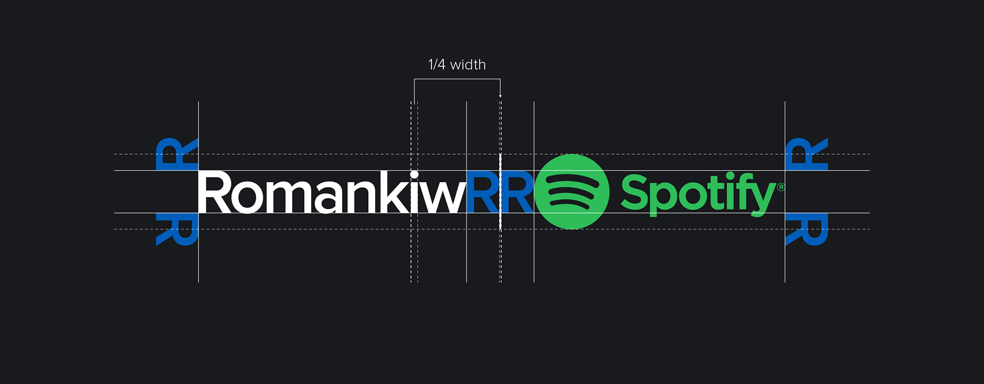
Partnerships
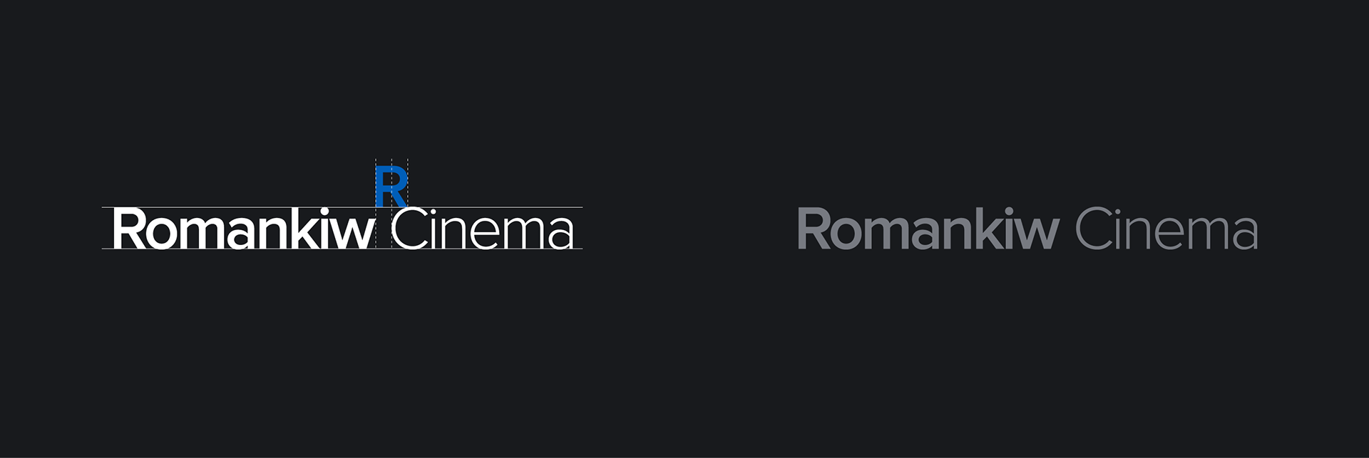
Romankiw often partners with different brands, and this is the layout that should be used as the template. The line separating the logos should be 1/4 the width of the 'i' in the logo.

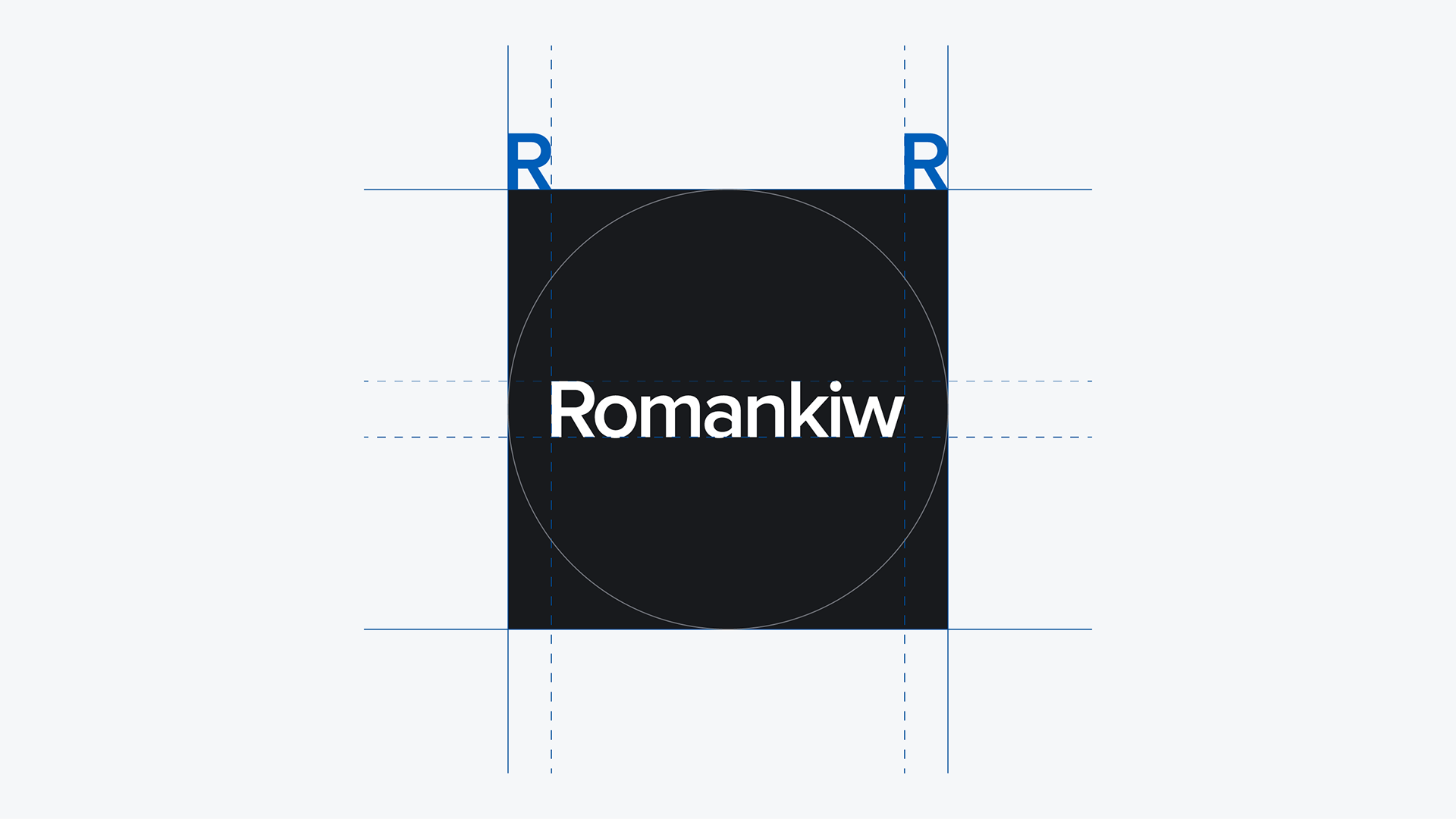
Icon construction
There are three different versions of the icons. There is a square, squircle, and circle version. The square will likely be the most utilized option, but the other two provide flexibility when needed.
Note: The clear space is allowed to be violated here to due the unique geometry of the icons. The width of the 'R' can be used as the basis for clearspace, as opposed to the height.
Social icons
The logo has the same placement across all the social icons as defined above.
Sub-brands logo construction
Sub-brands are different aspects of the Romankiw brand. There are two versions of sub-brand logos, a horizontal version and vertical version.
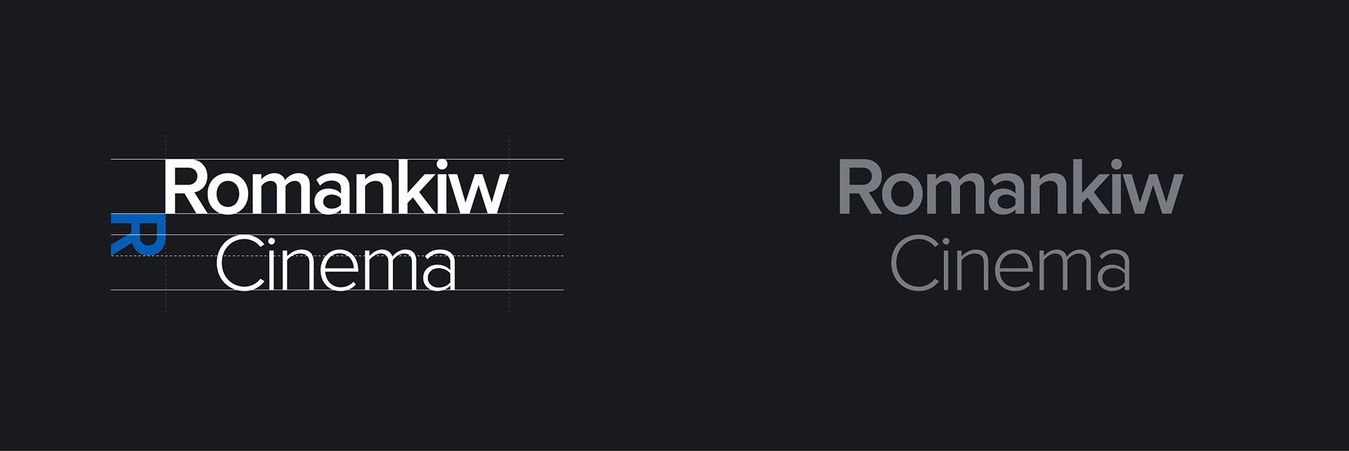
If the sub-brand title exceeds the width of "Romankiw", it must be left justified, not centered
Sub-brand logos
These are the sub-brands of the Romankiw brand.
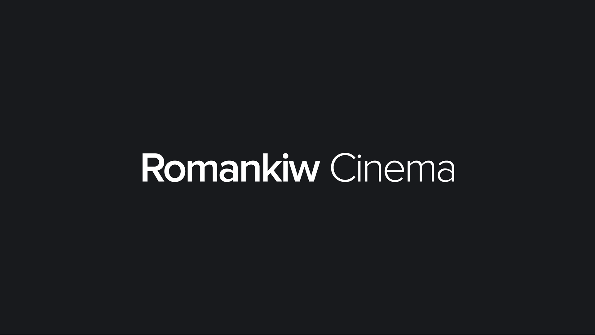
Romankiw Cinema - The most immersive home cinema experience. Dive into a new dimension of film that has never been seen outside the commercial cinema.
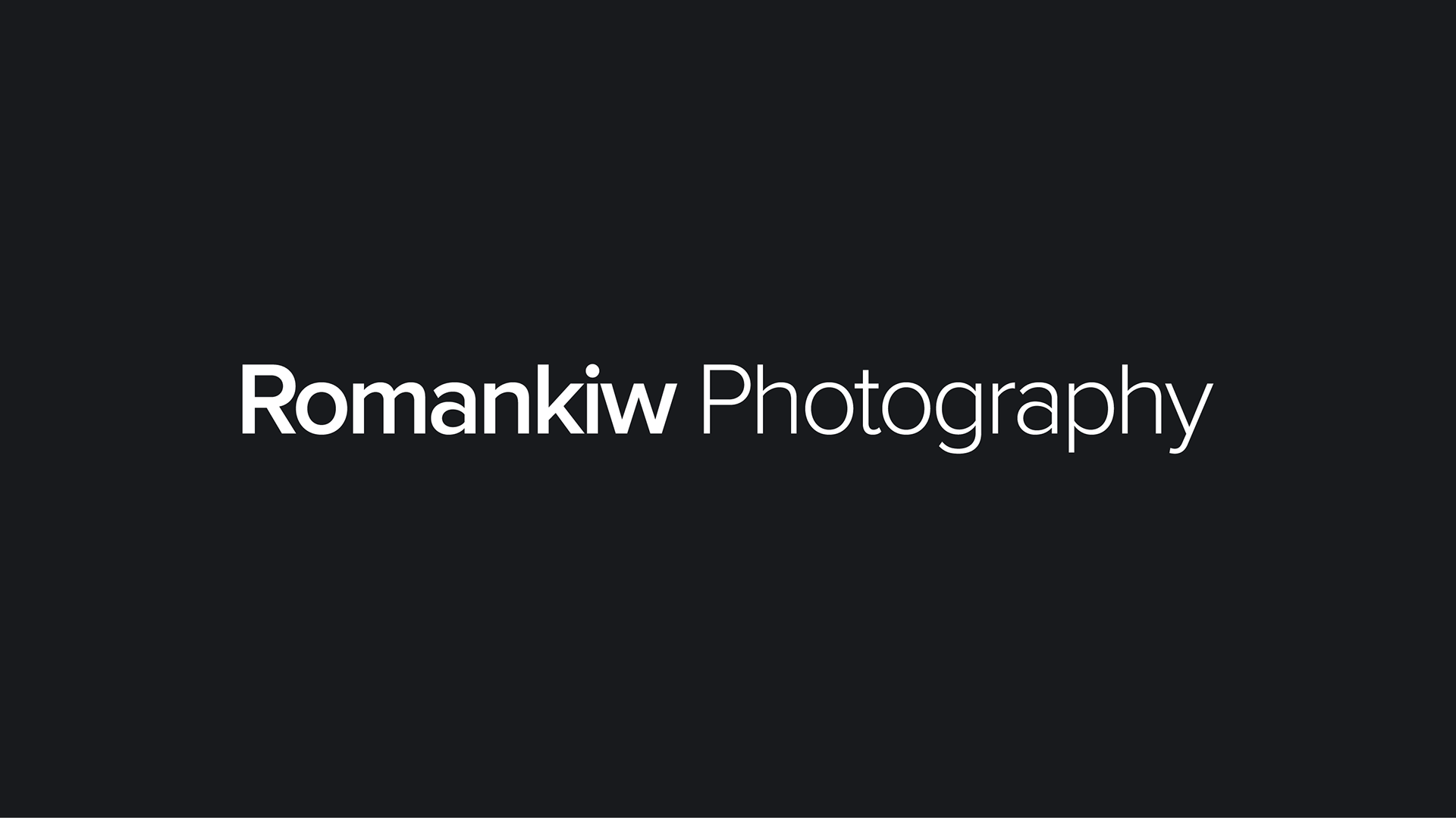
Romankiw Photography - The most immersive home cinema experience. Dive into a new dimension of film that has never been seen outside the commercial cinema.