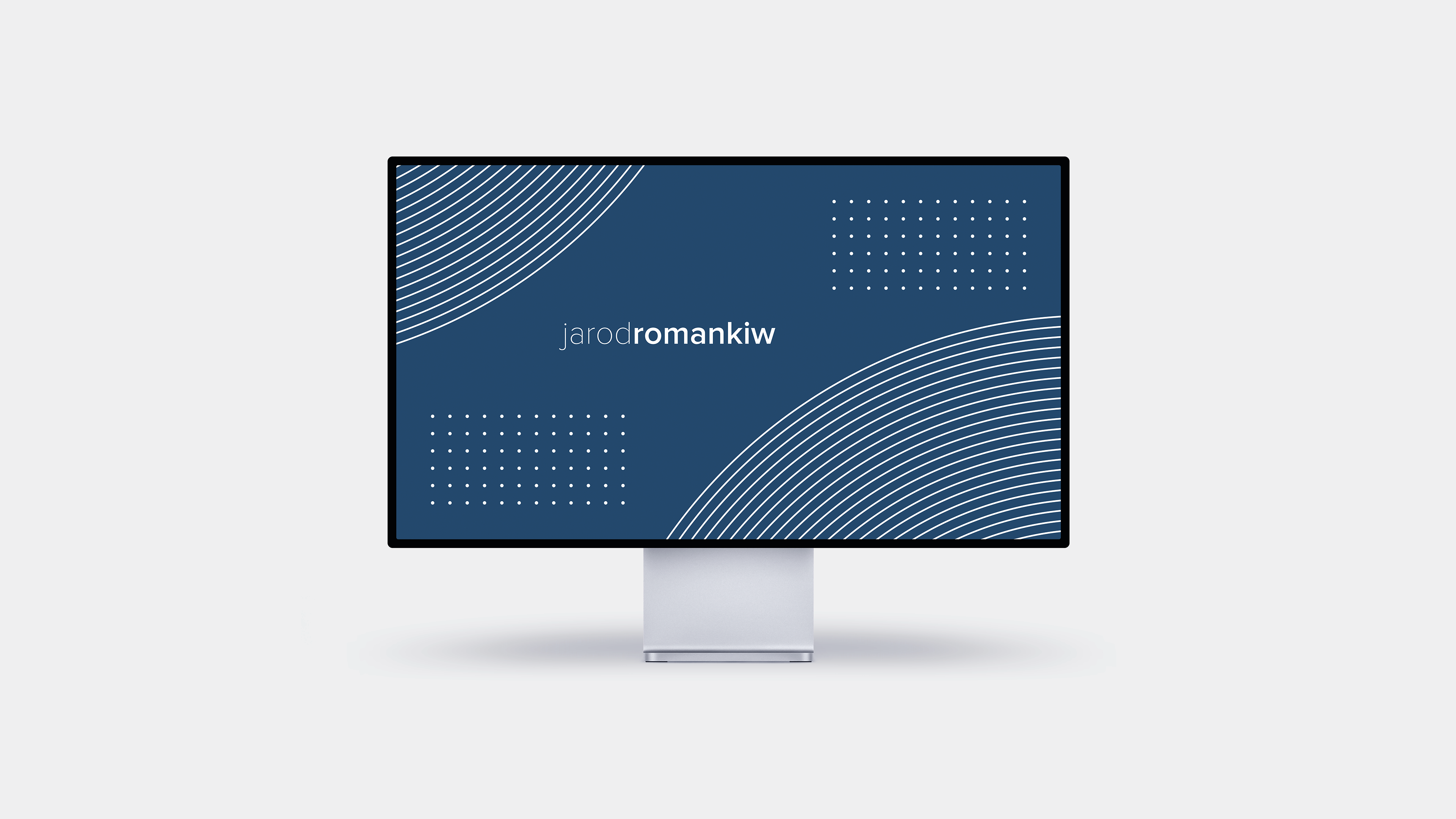
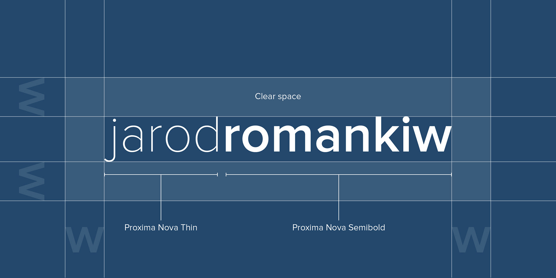
Logo Anatomy
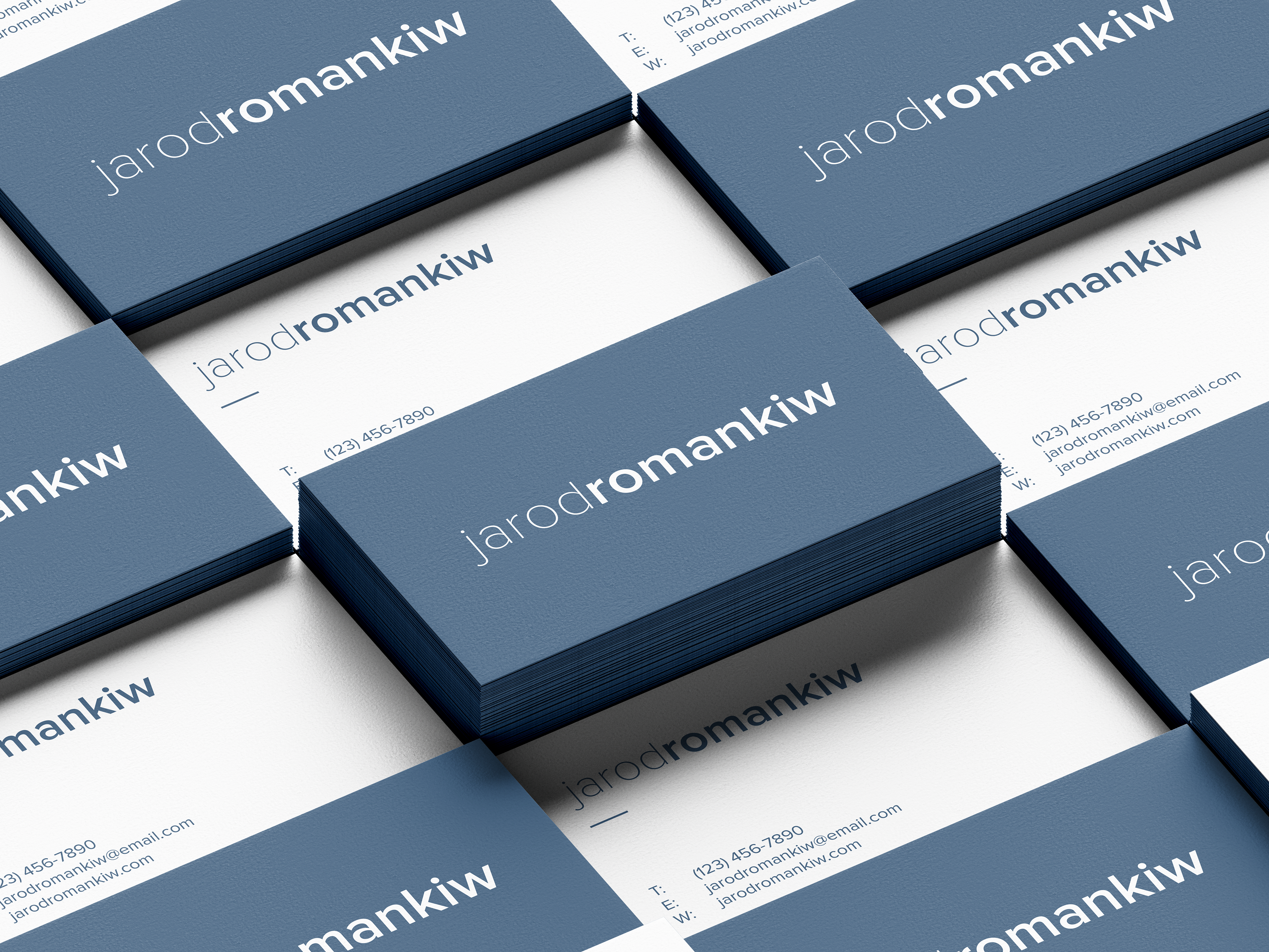
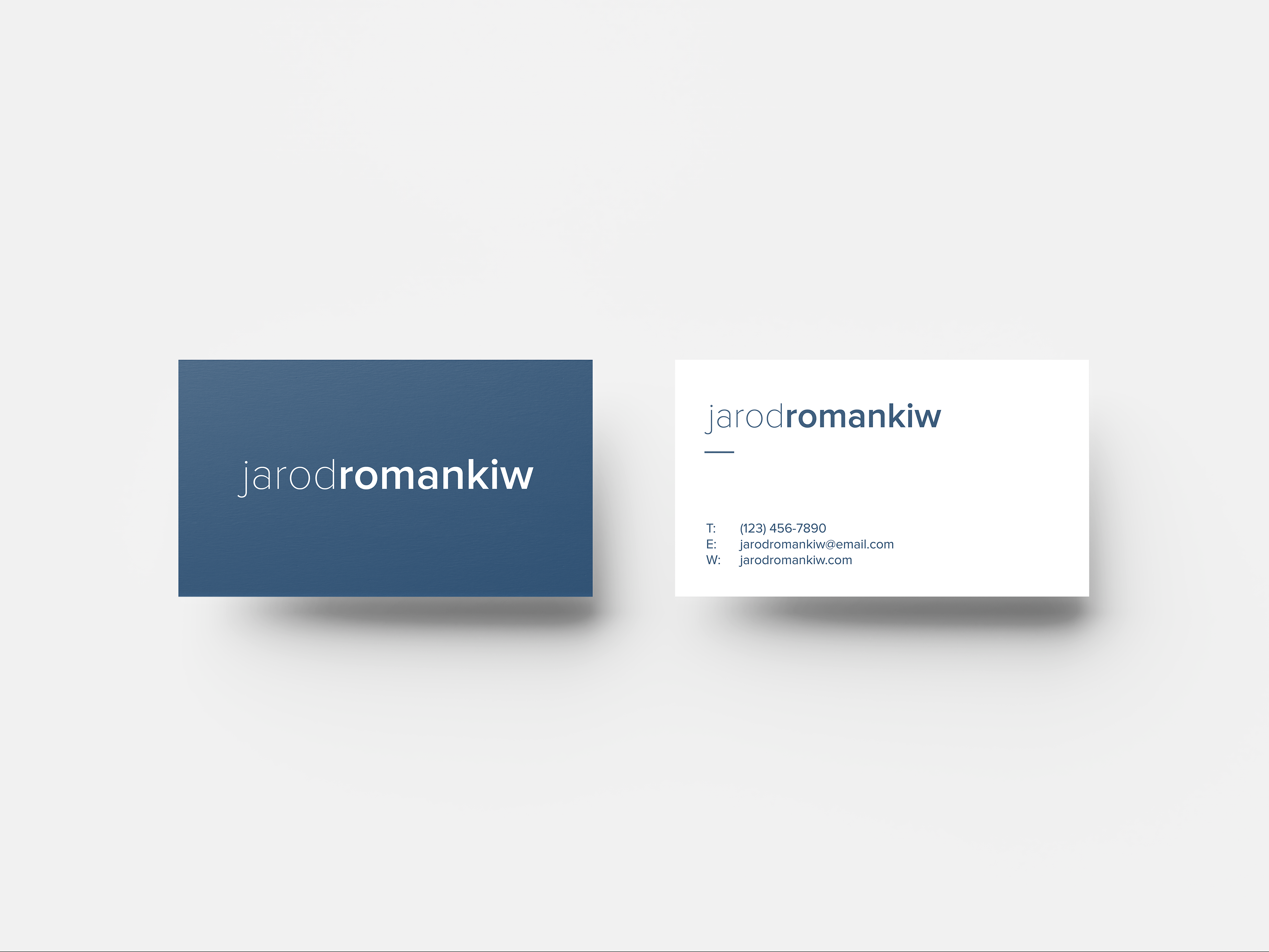
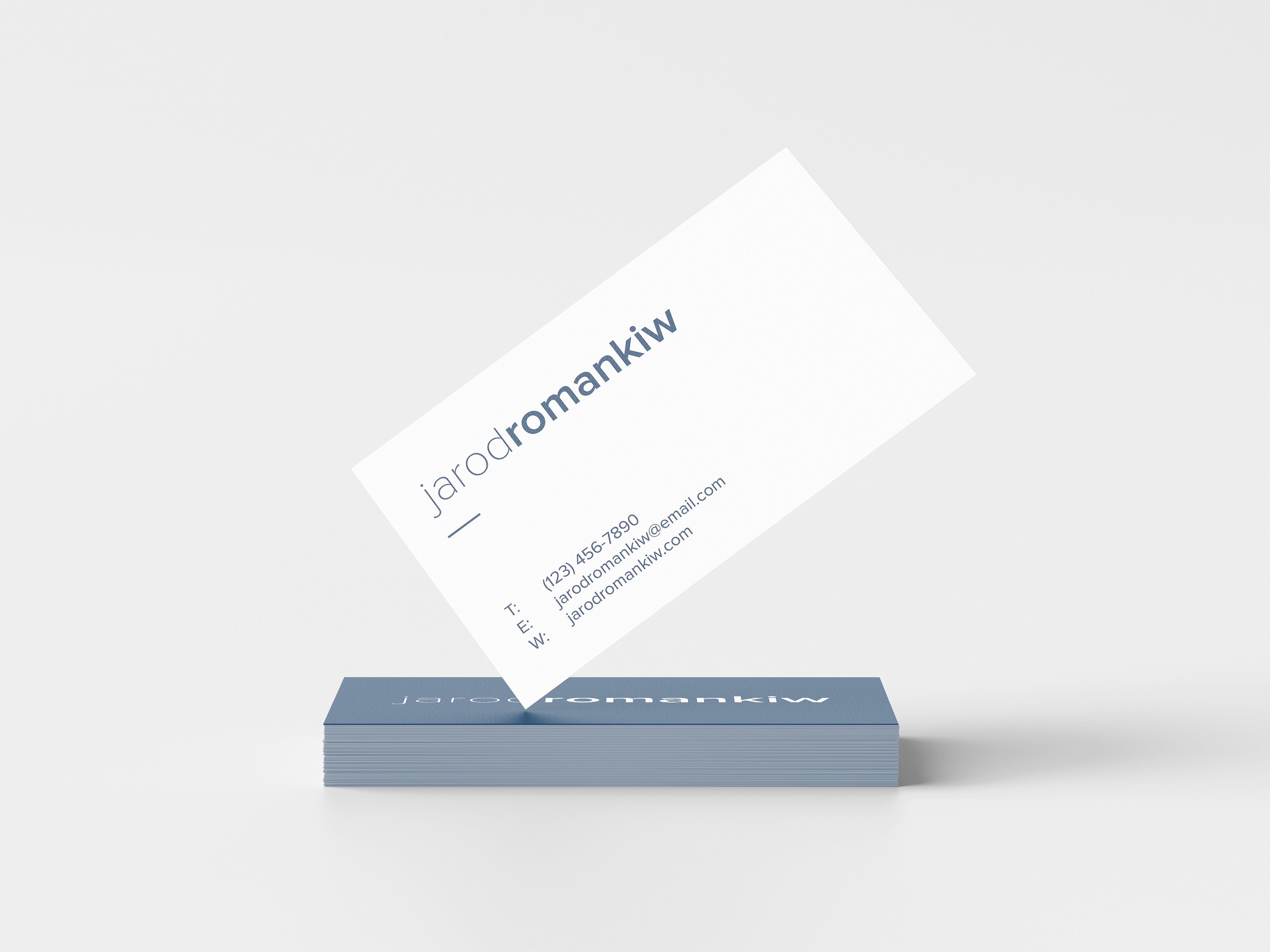
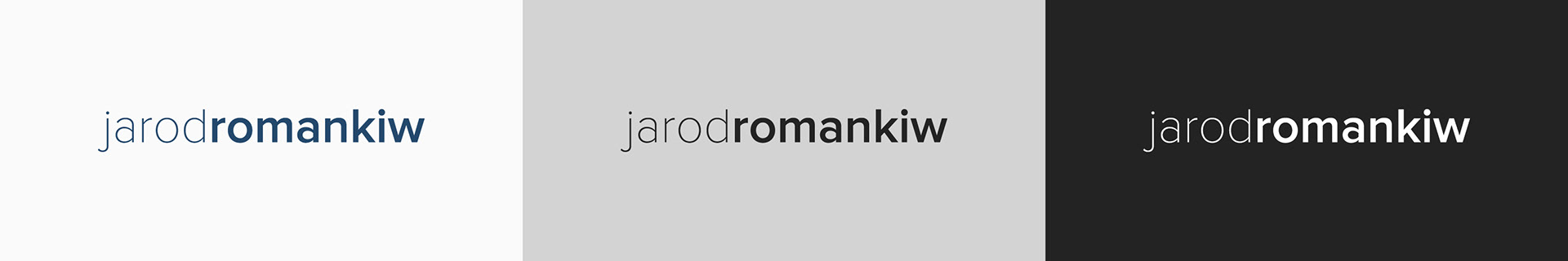
The logo has been updated to a simple word mark. It is a concatenation of my name 'Jarod Romankiw'. The logo is in lowercase with no space in-between the first and last name. Jarod is in Proxima Nova Thin font while Romankiw is in Proxima Nova Semibold font.
The clear space around the logo is to be equal to the width of the w in romankiw. The clear space applies to other objects as well as page edges.
Logo Variations
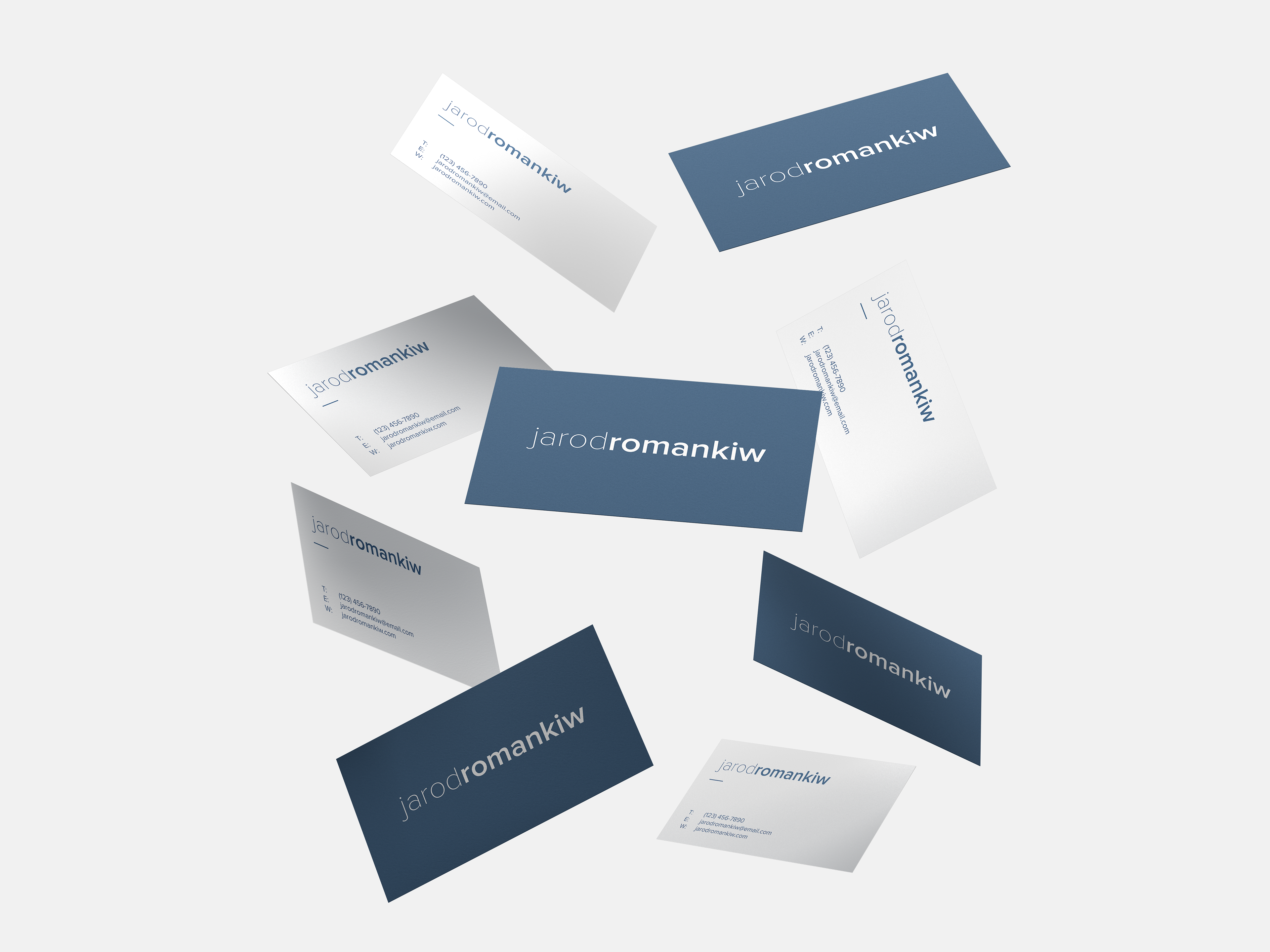
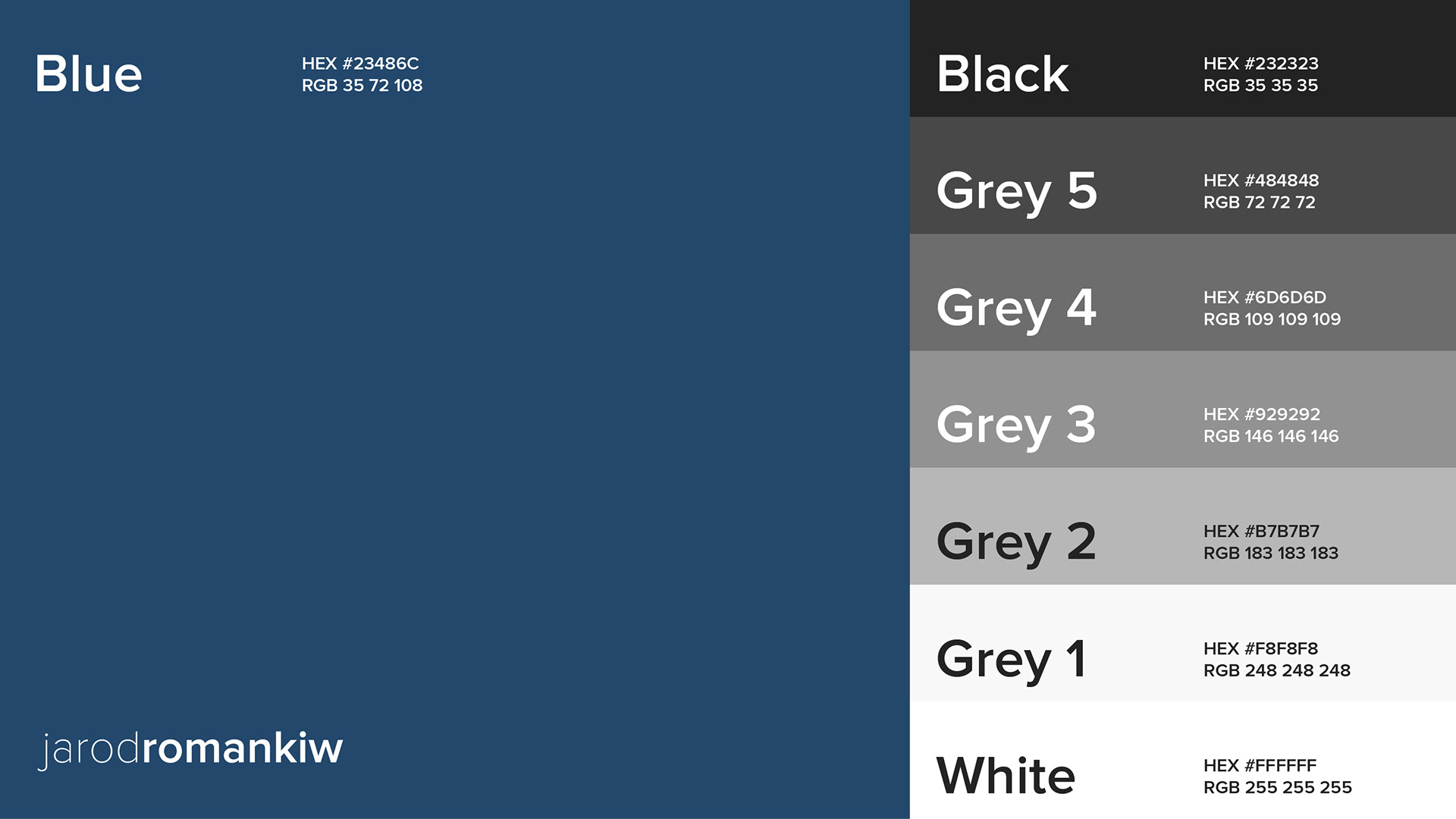
There are 3 different color variations of the logo: Blue, Black and White.
Colors
The color palette has been designed in order to adaptable to many situations, but be ver concise to the minimalistic approach of the brand. The main color is blue in the palette. A gradient from black to white is also provided to ensure consistent application of colors across a multitude of scenarios.
Typography
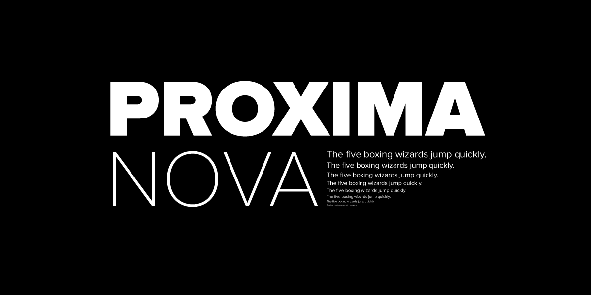
Proxima Nova is the font for the Jarod Romankiw brand. It's use is consistent across all elements of the brand and is intertwined in all aspects of it. Proxima Nova has a similar feel to that of Futura, which is a more widely available and popular font. But I liked the nuanced feel of Proxima Nova and the large family of fonts it includes ensured it would be timeless.
Font styling
In a paragraph style setting, there are 3 different styles to choose from. Header, Subheader, and Paragraph. Only 3 were chosen as to offer simplicity and encourage a minimalist tone. Additionally, Adobe Portfolio (the utility used to build this website) is constricted to only 3 text styles.
Header
Proxima Nova Bold (Size 60pt, Line Spacing 1.15, Black)
Subheader
Proxima Nova Bold (Size 26pt, Line Spacing 1.3, Black)
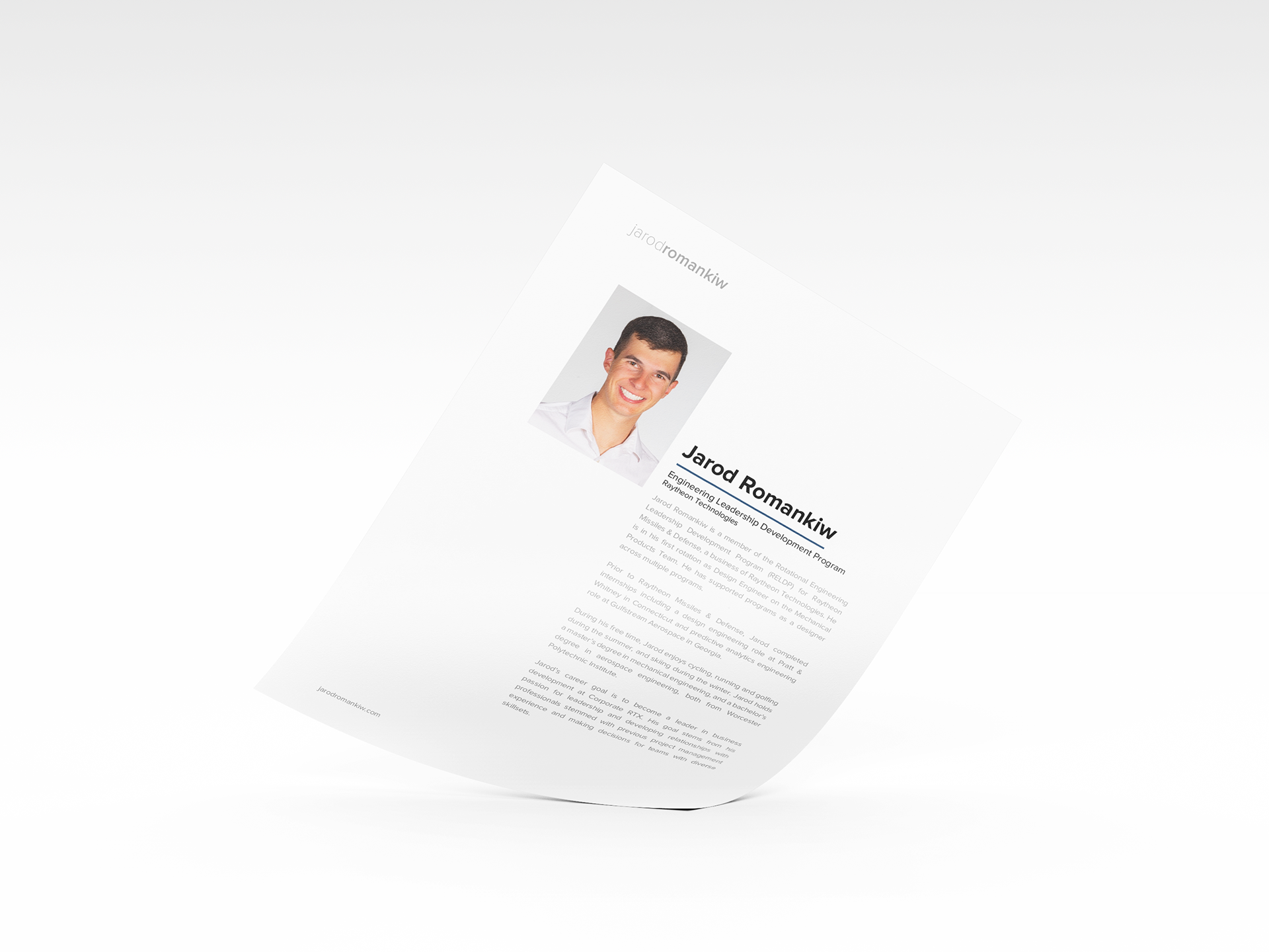
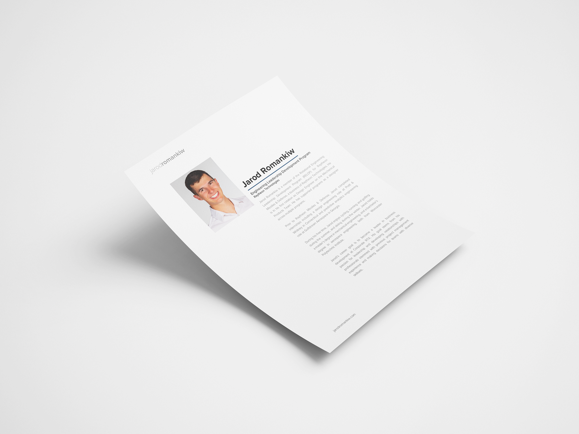
Paragraph
Proxima Nova Regular (Size 18pt, Line Spacing 1.5, #929292)